Unification + Style Guide
UI/UX • Design Leadership
Revinate’s products lived on two sets of UI since they were developed separately. In late 2015 we decided to unify them onto one consolidated interface.
This gave us better upsell opportunities, more consistent branding, and less design and front-end overhead. It was an enormous task, but a really significant step to bettering our and our product's UX, our process, and our teamwork.
Goals
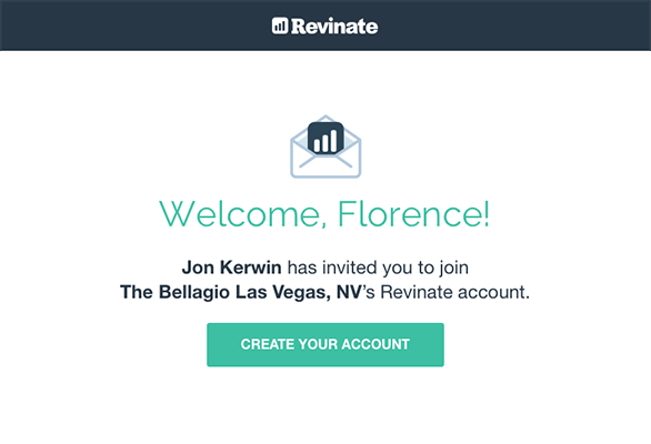
- 1 Surface features that allow users to be aware of what other services we provide for upsell opportunities
- 2 Consolidate our UI to give a consistent product experience
- 3 Create a living style guide to document all UI elements and patterns for developers and product managers to reference
The Process
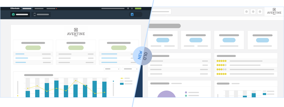
Old -vs- New UI
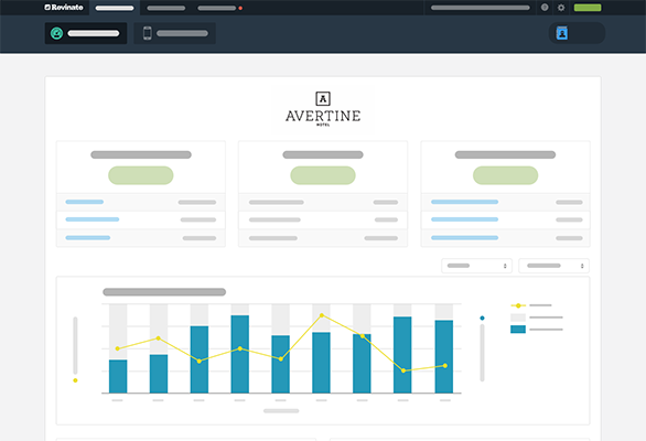
To move the older Reputation and Surveys products onto the new UI with our Marketing and Engage products, we had to update the navigation, sitemap, and consolidate UI patterns. The Marketing/Engage track had been developed without full design involvement, so this project was an opportunity to lay down basic color, page layout guidelines, and make patterns consistent in the new UI as well.
")
")
Prioritizing & Planning
As design lead, I solidified the project prioritization and timeline with the lead FE engineer and our CPO after I inherited this project. I laid out our shared understanding of the entire process, what the timelines are, what state different parts of the UI were in, what items still needed to be tackled (and how to prioritize them) -- and finally, action items we needed to take care of.
")
")
")
I led the charge to gather feedback from our Customer Success team to learn different use-cases, and worked closely with Product and Eng to determine the application sitemap and hierarchy.
Global Elements
Our first set of tasks involved parts of the interface that would be visible at all parts of the app. This included color rules and page layout rules, design and behavior of primary, secondary, and tertiary navigation, as well as filter elements.
")
")
")
")
")
Style Guide
The timing presented a great opportunity to establish a style guide in parallel, so we used Bootstrap 3 as the base and systematically went through our UI elements to pinpoint what was high-priority.
Responsibilities
- UI/UX
- Design Leadership
- Information Hierarchy
Here's what I've worked on