Email Strategy
Visual • Information Hierarchy • Graphics
In 2015, Revinate's application and brand had gone through a redesign, so we knew that we had to up the game on our email strategy to customers as well. This involved improving emails from the application, marketing, and as well as communications from the Training + Support team.
Goals
-
1
Furthering usability by enforcing content, layout, and color rules
I used this opportunity to bring in the visual patterns we established in the application (the way we present reviews, CTAs, color rules, etc.) to be ported over to our email designs. -
2
Consistent branding to establish familiarity and trust
Our email strategy included our first contact with most of our customers. Our application and corporate website had grown and evolved over the years, but our emails had not, and we fixed that. -
3
Clearer user goals
I advocated for less text, more focus, and very obvious calls-to-actions in the new designs. Our previous emails were information-heavy, and the links did not stand out very much, or there would be many calls-to-action in one single email.
" Love the new look of this. You guys continue to keep it fresh." – Kevin Scott, General Manager of HOTEL MAX
Project Details
Taking Inventory
This project gave us the opportunity to rethink the entirety of our customer communication from the ground up. I started with taking inventory of the entirety of the emails we send out to customers. Throughout the years the teams lost track of what kinds of emails were being sent out and when across all the different departments, so having a list and document for everyone to refer to was helpful to understand the variety of all the different emails we sent in totality.

Starting from Scratch
I began looking for repeated layout patterns in the emails. After sketching a few out, I identified rough building blocks such as 1-column, 2-column, 3-column layouts (and how that would translate on mobile); as well as individual elements that would need to be defined (i.e. H1 text, body text, CTAs, etc.).
")
")
")
")
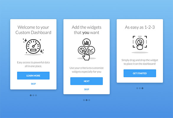
Application Emails
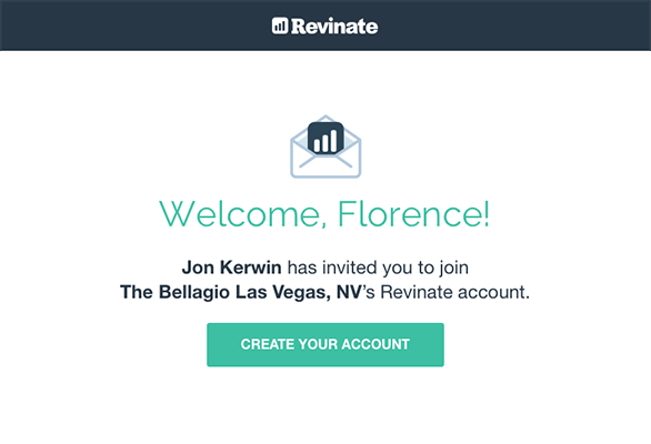
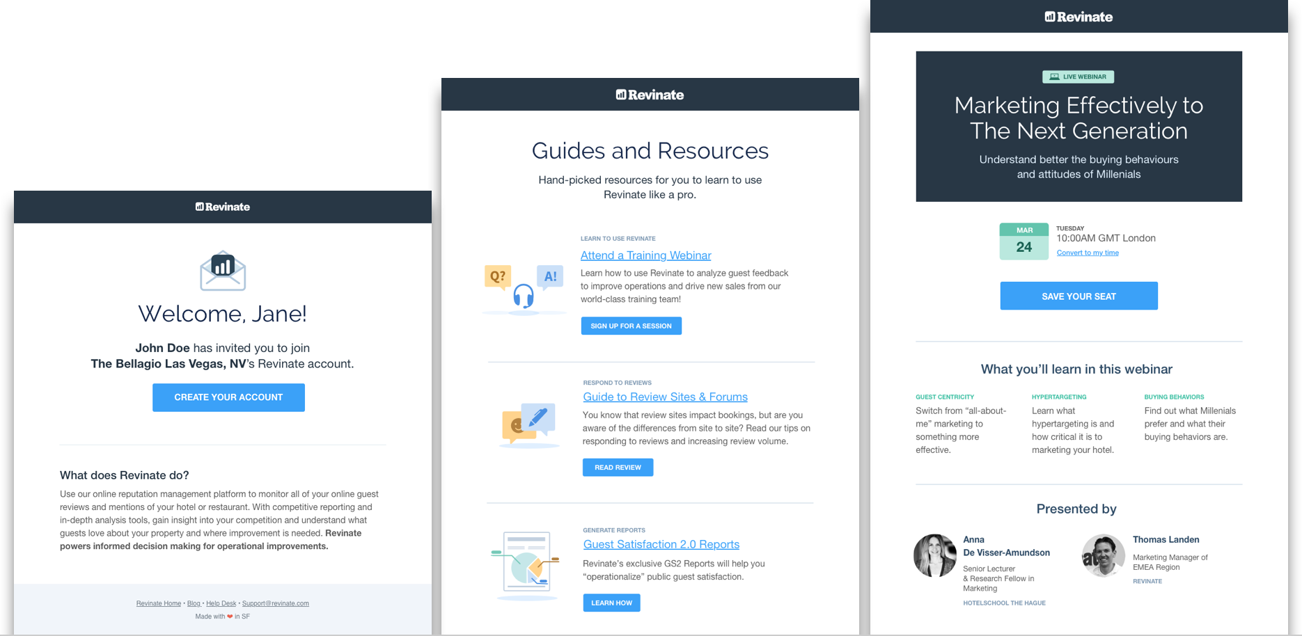
I worked closely with Product and Support to determine what content we should keep and what content we could cut from the emails. Some emails had a lot of text (i.e. our email to invite users to create accounts, which is a critical email). I proposed a more focused email so users would not get distracted (or worse, lose interest and abandon the email).
I took the opportunity to inject some visual elements into the emails to break up blocks of text; I wanted to make the point of contact engaging and friendly.
")
")
")
")
")
")
")
")
")
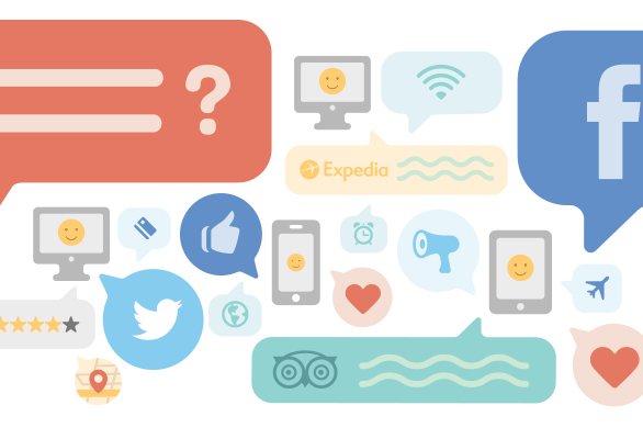
Marketing Emails
I designed email templates with modular sections for Marketing so that the team would be more self-sufficient in building email campaigns. The layouts were made to be flexible so that they could delete/add sections as need be.
")
")
")
")
")
Cohesion and Consistency
With this project, application and marketing emails were updated to be on-brand and consistent with each other. We also tackled responsiveness since we knew that many users checked their reporting emails on their phones.
Kevin Scott, the general manager of HOTEL MAX actually emailed in a compliment to one of our account managers and told her: "Love the new look of this. You guys continue to keep it fresh."
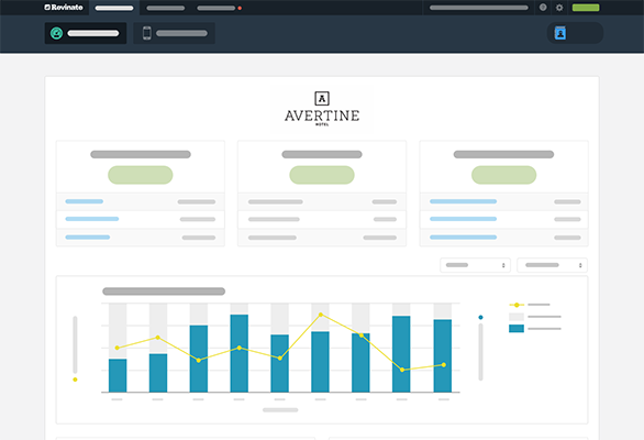
Below is a screenshot of some application and marketing email templates together. A consistent visual story is told, and layouts are organized into consistent patterns.
")
")
")
Skills & Tools
- Graphics
- Visual Design
- Information Hierarchy
- Sketch App
- AI Adobe Illustrator
Here's what I've worked on